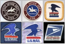
In 1955, Former PMG Arthur E. Summerfield authorized the first emblem patch for uniforms worn by letter carriers. Employees were not required to wear them until 1957.
The original emblems were 3-inch circular patches with a backward (facing right) horse and rider that were worn on the left sleeves of shirts and coats.
The direction of the horse and rider was flipped to face forward in early 1965. The center background was changed to blue.
The eagle “seal” was adopted following passage of the Postal Reorganization Act in 1970 — the law that created USPS as an independent establishment of the government’s executive branch. That same year, the 3-inch circular uniform patch was replaced by a 3 1/2-inch square one that featured an eagle facing left atop a red bar over the words “U.S. MAIL” and a blue bar underneath.
In 1990, the patch was redesigned to feature a blue eagle facing right atop a red bar, over the words “U.S. MAIL.”
In 1995, USPS adopted a corporate logo that included the “sonic eagle” — often described as an eagle’s head and beak leaning into the wind. The same year, USPS introduced a new patch, square-shaped and canted slightly to the right to simulate the impression of movement. Embroidered in black were the words “UNITED STATES” underlined by a thin red line and followed by the words “POSTAL SERVICE.”
The 1995 patch still is in use today.
